Chart Type
In the NEO UI, users have access to many predefined widgets for viewing data on dashboards in addition to entire analytic dashboards with predesigned widgets. However, users can create their own custom analytic widgets and specify the data subset, the formula (where required), and data visualization. Custom analytical widgets support near real-time measures from the Value Chain Data Warehouse (VCDW) tables. The widget functionality and configurability mirror the pivot table/chart functionality that many reports offer in the ONE system, yet provide the additional benefit of constant visibility to the data from the dashboard. Users can add these widgets in both the columnar and fixed layouts by selecting the Custom Analytic Widgets tab on the Add Widgets popup. Filter attributes provide further customization with the date datatype based on absolute or relative dates. For example, users can set a pickup date relative to the current date (such as five days from the current date); this is particularly useful if the user wants data to be populated on the widget dynamically.
Pivot tables, grids, and charts are supported, including the following data visualizations:
|
Chart Type |
Definition |
Example |
|
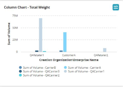
Column |
A column chart shows a comparison of data using verticle columns. Multi-column charts cluster groups of data columns to make comparisons. |
|
|
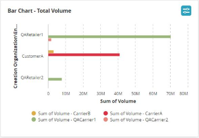
Bar |
A bar chart shows a comparison of data using horizontal bars, similar in nature to the column chart. Multi-bar charts cluster groups of data bars to make comparisons. |
|
|
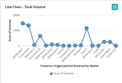
Line |
A line chart typically shows data trends over a period of time. |
|
|
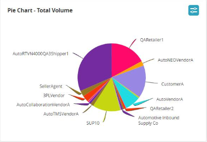
Pie Chart |
A pie chart shows data as part of the whole, as part of a 100% total. |
|
|
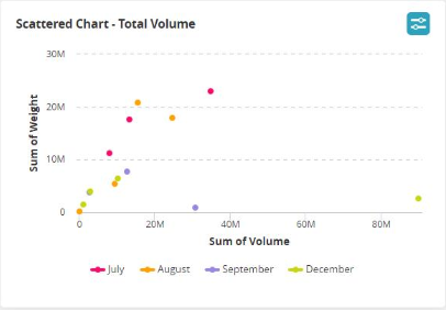
Scatter |
A scatter chart displays values for two different variables where each dot is a data point and is used to observe relationships between variables. |
|
|
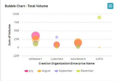
Bubble |
Bubble charts are used to emphasize specific values, most frequently used with financial data. |
|
|
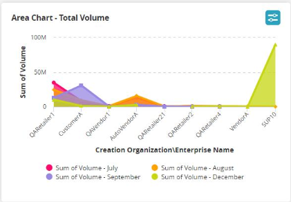
Area |
An area chart is similar to a line chart, typically showing values over time. However, the area chart fills in the chart with color |
|
|
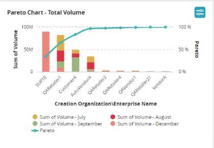
Pareto |
The Pareto chart helps count and categorize data so users can perform a business analysis based on the 80/20 rule. |
|
|
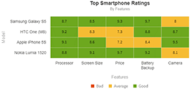
Heat Map |
A heat map provides a table of data with cells colored to show data status. For example, red cells may show bad or critical status. Yellow cells may show average or warning status. Green cells may show good or satisfactory status. |
|
|
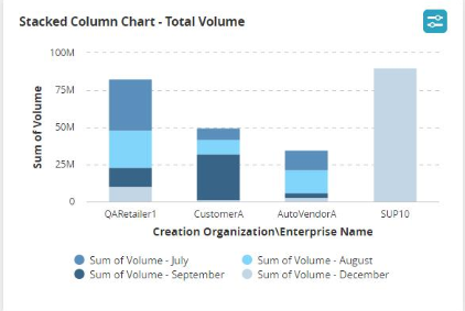
Stacked Column |
A stacked column chart shows columns of data with multiple data points aggregated within each column. |
|
|
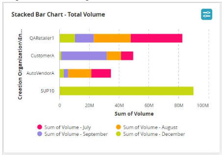
Stacked Bar |
A stacked bar chart shows bars of data with multiple data points aggregated within each bar. |
|
|
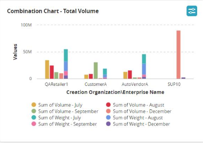
Combination |
The combination chart allows users to combine multiple chart types within a single view. The example below shows a column chart with stacked columns. |
|
|
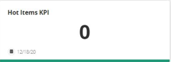
Simple KPI |
A simple KPI chart displays a single data point value. |
|
|
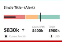
Complex KPI |
A complex KPI chart displays a data point at current, previous, and targe values. |
|
|
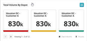
Leaderboard - Simple KPI |
The Simple KPI Leaderboard allows users to view customers, sites, districts, etc. with a selected data point. |
|
|
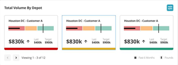
Leaderboard - Complex KPI |
The Complex KPI Leaderboard allows users to view customers, sites, districts, etc. for a selected data point at current, previous, and target values. |
|