Pivot Charts and Tables
Pivot tables and charts are used to summarize the data using a variety of visual displays. Users can create a custom analytic widget from within the NEO UI using the workbench and add it to a NEO dashboard. The workbench allows users to select a data source, select the fields and measures, and select the type of chart to best present the data visually.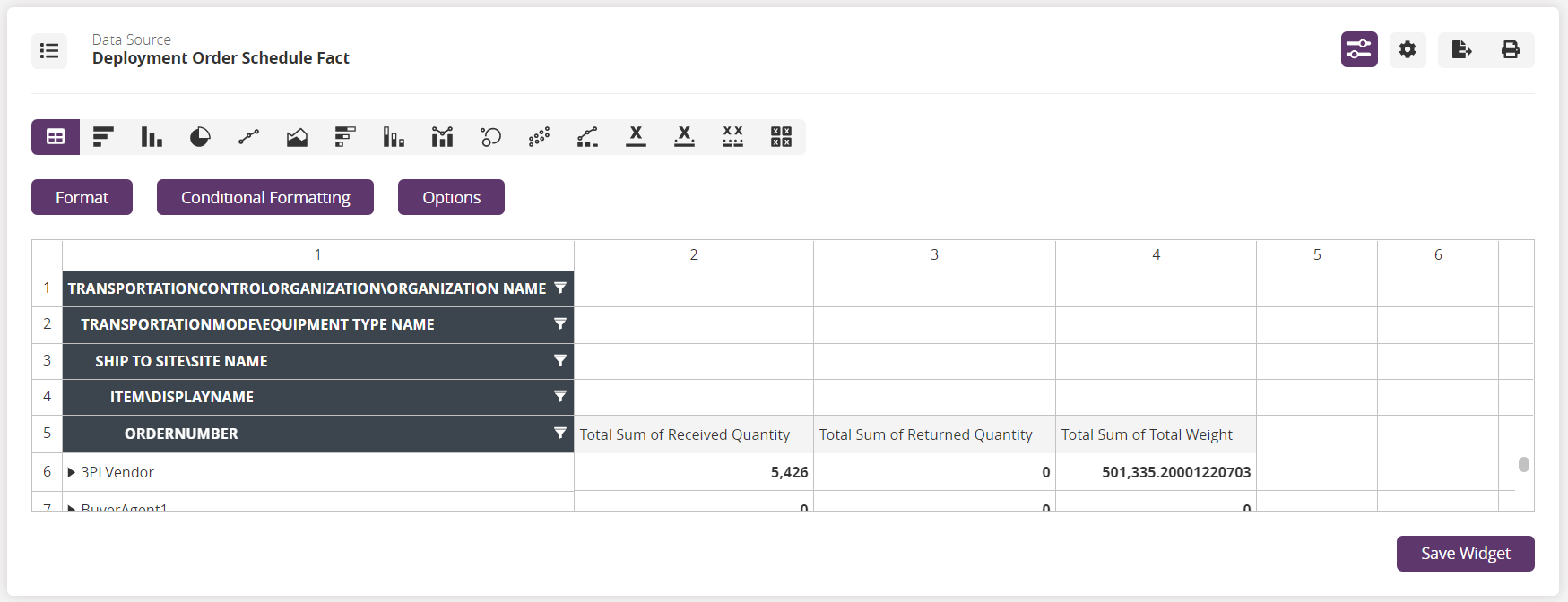
Various existing reports also include a View Pivot button that, when clicked, displays the data in a table.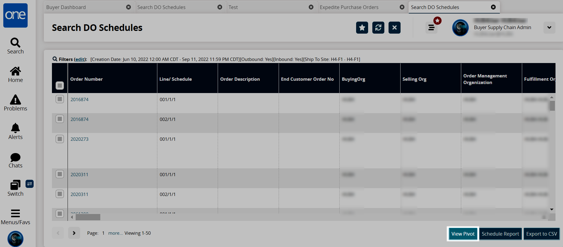
The following pages provide a deeper dive into the many facets and features available when using pivot tables and charts.