Pages
A Page dictates the layout of the model form. The Page Editor allows an Administrator to configure the layout by dragging and dropping Field and Layout Widgets into a workspace area. The Page Editor supports several Layout Widgets, including Multi-column containers and Tabs, allowing some flexibility on the look of the screens.
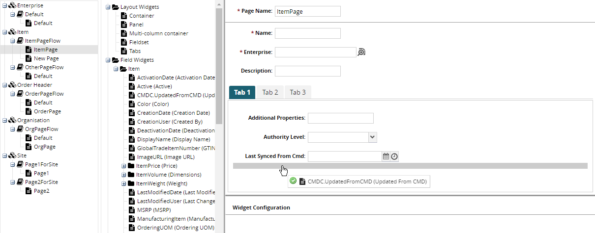
At the bottom of the Page Editor is a Widget Configuration panel. When the Administrator selects a Field or Layout Widget that has been added to the workspace, the Widget will have a blue background and the Widget Configuration panel will display a form that allows him to tweak it.
The configuration available to a Widget depends on its type. Most configuration fields are simple and straightforward, but there are a few that require some explanation.
Height and Layout for Layout Widgets
All Layout Widgets (or Containers) have Height and Layout configuration fields. Together, they provide a few useful variations for how Containers should be laid out. See the following screenshot which has 4 Containers, each of which has a different configuration:
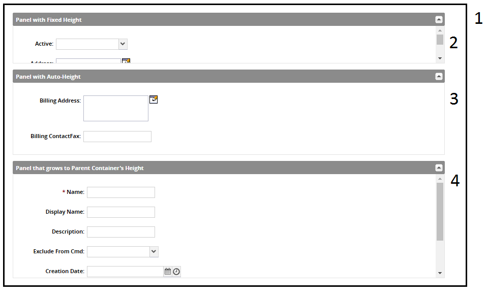
This represents the outermost container within the Page Editor. The outermost container's Height should generally always be set to grow to fill the entire screen. The Layout is set to not get a scrollbar but instead have its child components fill to match its height.
Height: Grows to match the outer container
Layout: At least one inner component will grow with this container's height
A container with fixed height, so the Layout should be set to use a scrollbar when its child components fill it up.
Height: Fixed
Layout: If inner components grow beyond this container, use a scrollbar
A container whose height will always match the height of its child components, so it will never get a scrollbar. In fact, the Layout field is irrelevant for this type of container.
Height: Grows to match its inner components
Layout: If inner components grow beyond this container, use a scrollbar
A container whose height will grow to match the outer container. In order to set a container with this Height, its outer container must have its Layout set to At least one inner component will grow with this container's height.
Height: Grows to match the outer container
Layout: If inner components grow beyond this container, use a scrollbar
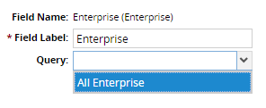
Query for Model Link Fields
Model Link Fields can be added to the workspace by the Administrator, but their picker and autocomplete config must be specified to determine what set of models the User has access to choose from. So, the Administrator can set a value for the Query config field. Queries are registered by the Developer using the following API:
One.ext.page.PageManager.registerModelLinkQuery({ name: 'AllEnterprise' ,modelLevel: 'Enterprise' ,staticConfig: { pickerView: { viewName: 'ZPTS.AllEnterprise' ,customModelName: 'Standard Enterprise' } }});Note in the example above that although only pickerView is populated, the autocomplete portion of the Ext.form.ModelLinkField should generally also be populated in real code. Calling that function will allow the Administrator to see the following: