Network Cost Analysis and Performance Reports
You can view cost analysis and performance reports for the network, partners, and carriers. Afterward, you can export the report to an Excel spreadsheet or view in a pivot table with options for views as a grid, pie chart, bar chart, line chart, or scatter chart. The following procedure shows how to view a network cost analysis report. This procedure is similar to those for the cost analysis reports for partners and carriers as well as for performance reports for a network, partners, and carriers.
Complete the following steps to view network cost analysis reports:
L og in to the ONE system.
Select Menu/Favs > Reports > Analyze > Network Cost Analysis.
In the NEO UI, users can click on the Menus/Favs icon on the left sidebar and type in the name of the screen in the menu search bar. For more information, see "Using the Menu Search Bar."
The Network Cost Analysis screen appears.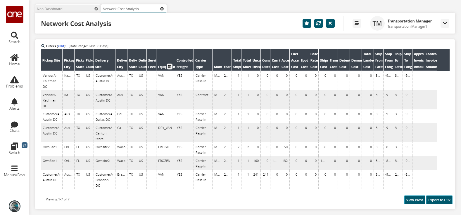
Click the Filters (edit) link to apply search criteria to reduce the number of entries shown.
The Filters menu displays.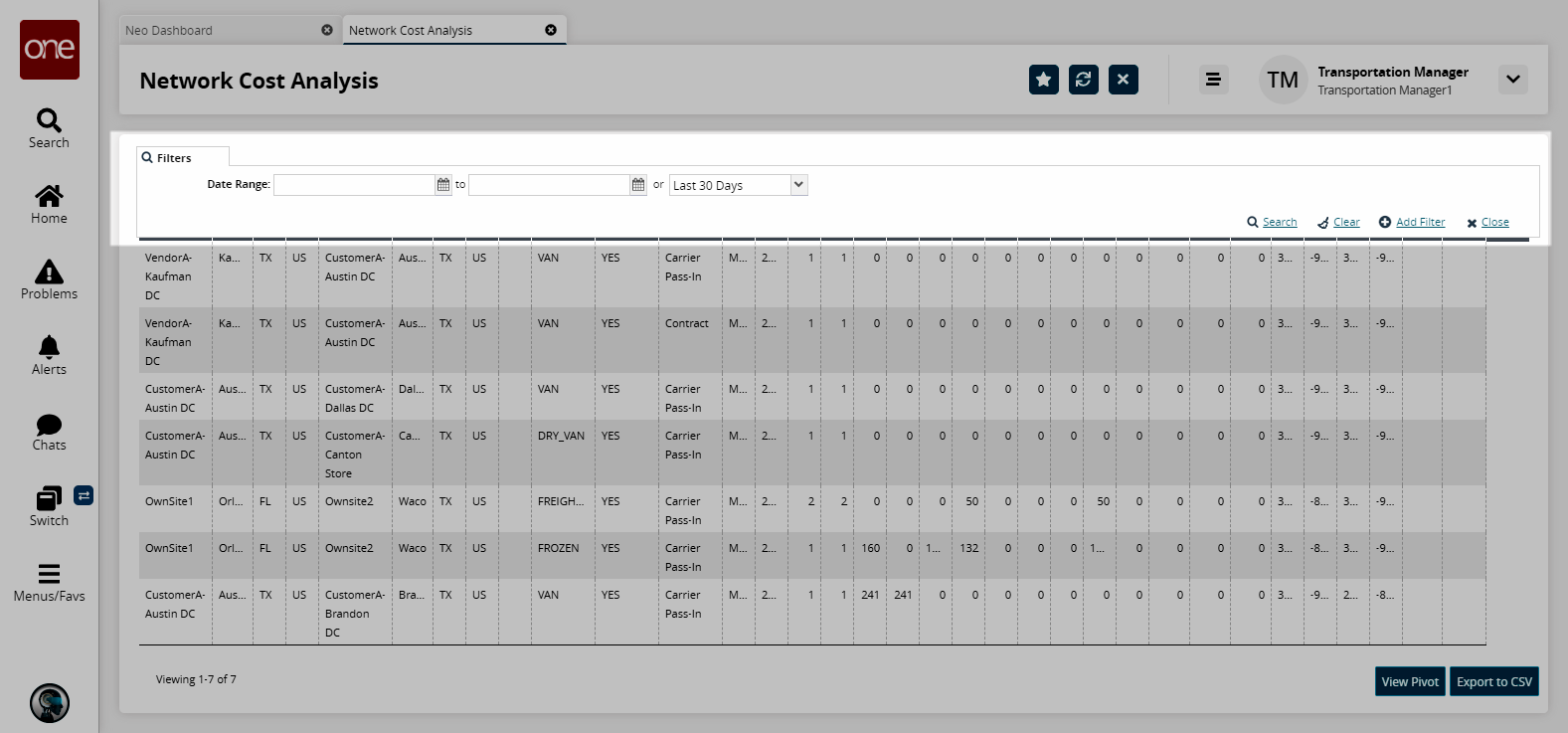
To add more search filters, click the Add Filter link, and then click one or more filter options from the Add Filter list.
Fill out the filters as desired, and click the Search link.
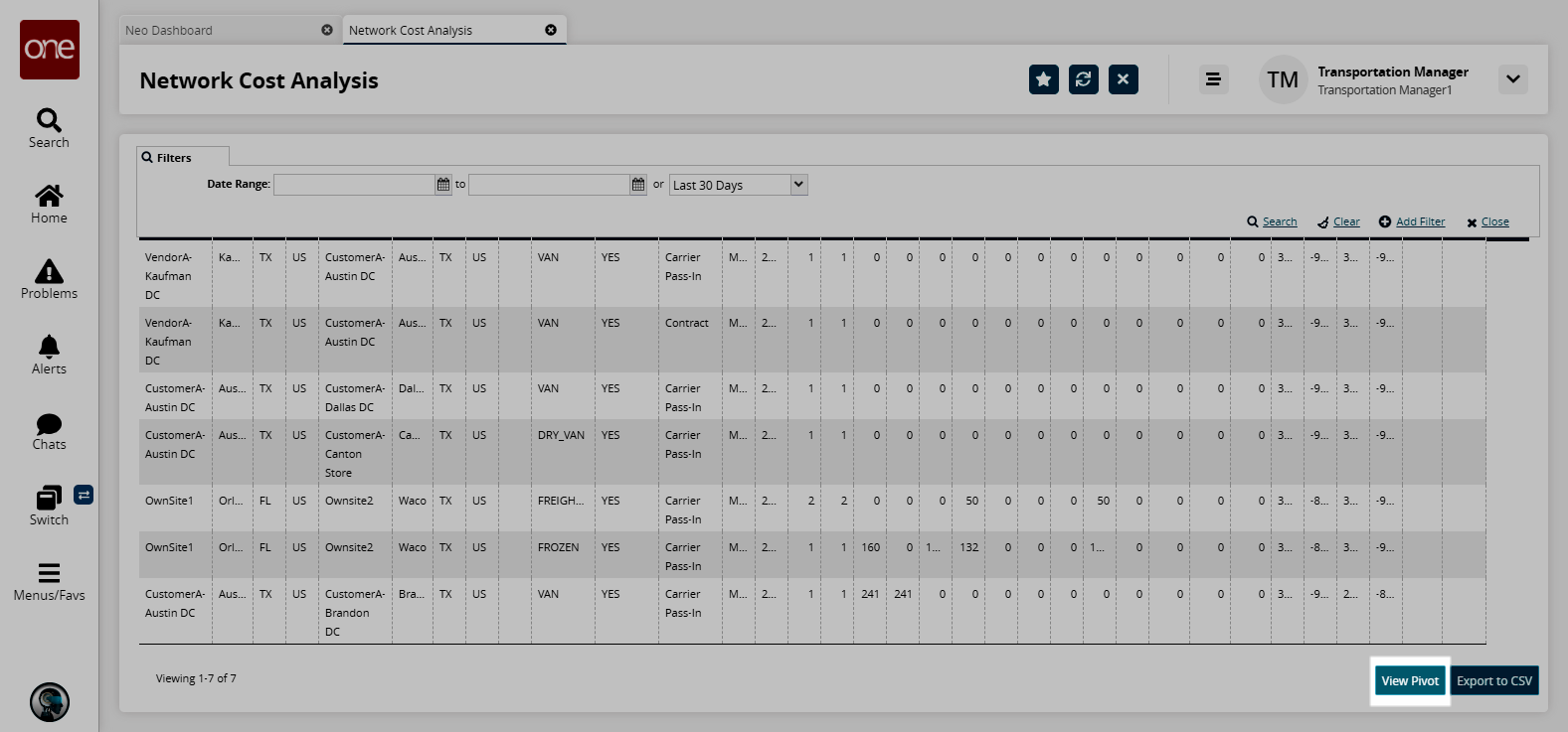
The search results display.Click the View Pivot button to view the report in a pivot table.
The Analytics Pivot screen appears.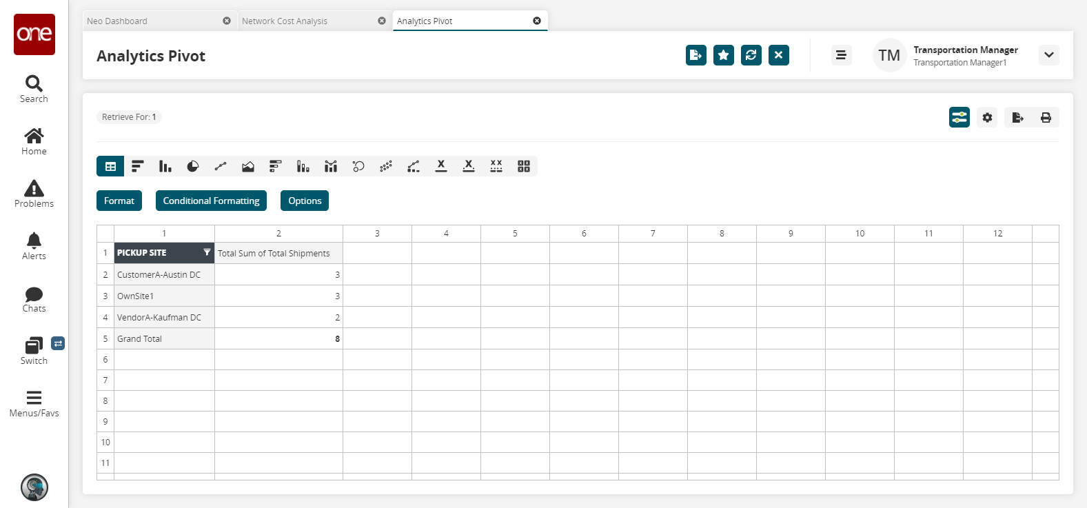
Drag and drop options from the Select Dimensions list onto the Report Filter, Rows, Columns, and Values boxes to c reate the layout of the pivot table.
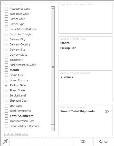
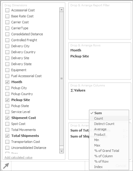
To select another operation on the value, click the option button to open the operation list, and then click an option.
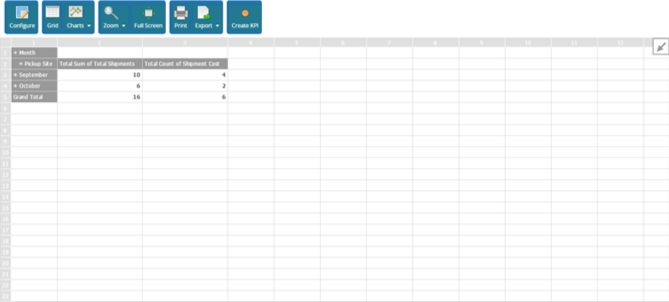
After all dimensions and values have been selected, click OK. The pivot table appears in the default grid view.
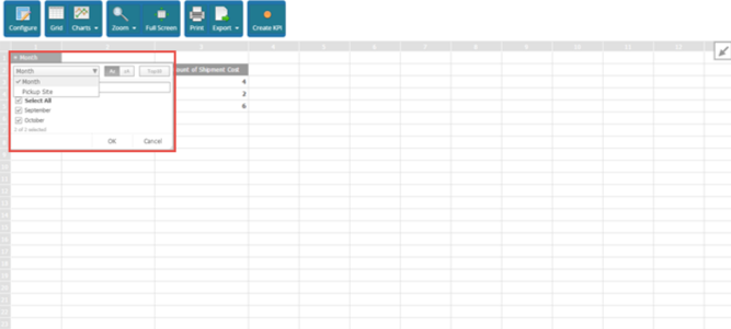
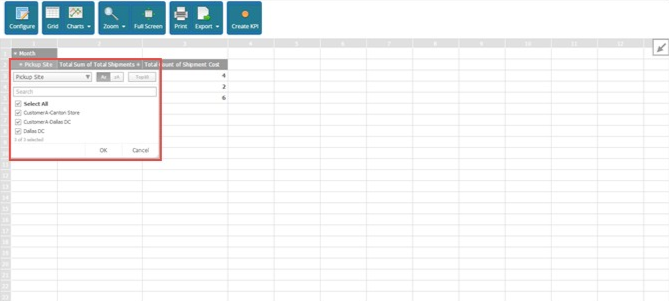
To change the Report Filter (Month in the following figure), click the option arrow to open the filter list.
As required, type characters into the Filter box to match equipment names, or scroll the list until the desired equipment is visible. Click the equipment name to select it, and then click OK.
Similarly, click the option arrow on the row selection to view filter and sort options.
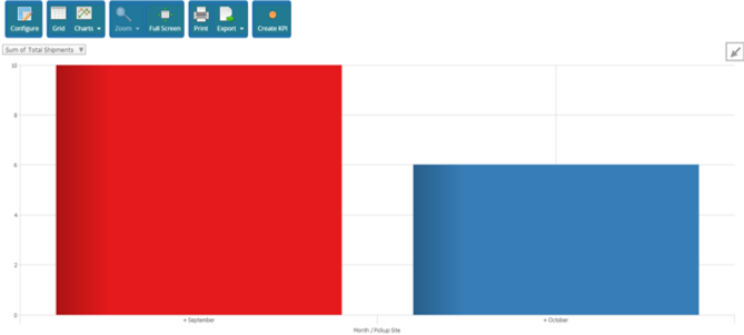
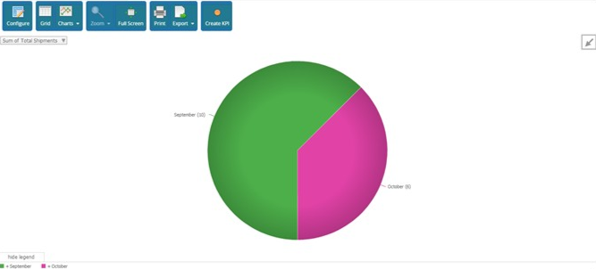
To view the pivot table in a graphical chart, click the Charts button, and then click a chart option from the list.
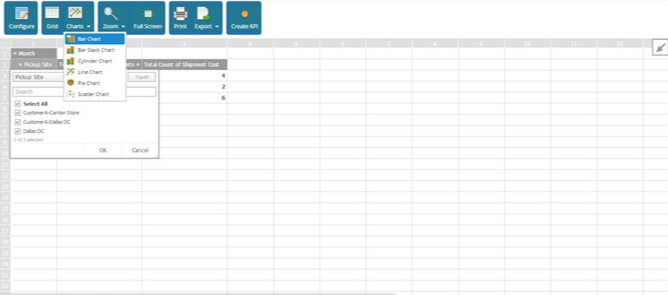
The following figure shows the Bar Chart option.
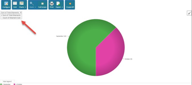
The following figure shows the Pie Chart option.
To select another value option, click the option arrow, and then click an option from the list.
To return to the grid view, click the Grid View button.
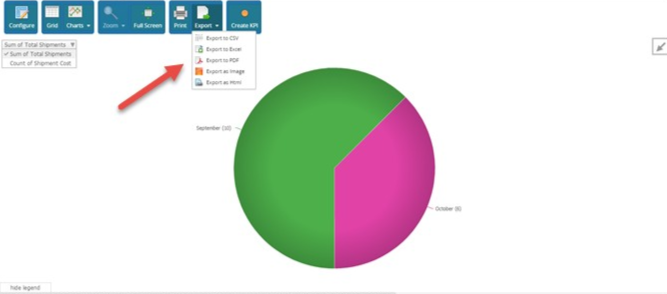
To export the table to a file format, click the Export button.
To view the pivot full screen, click the Full Screen button.
To return to normal screen, press ESC.
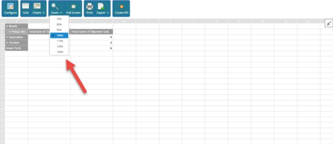
While in Grid View, click the Zoom button to select a zoom level from 70% to 130% to resize the table grid.
Adding Price Column to Network Analysis Report
Users can view Standard Network Analysis reports and gain insight into the entire network including clients, shippers, and partners. The new Price column is added to the standard network reports for calculating revenue per lane and cost prices. Uses can add or hide the Price column as needed.
Complete the following steps to view the network analysis report:
L og in to the ONE system.
Select Menu/Favs > Reports > Analyze > Network Cost Analysis.
In the NEO UI, users can click on the Menus/Favs icon on the left sidebar and type in the name of the screen in the menu search bar. For more information, see "Using the Menu Search Bar."
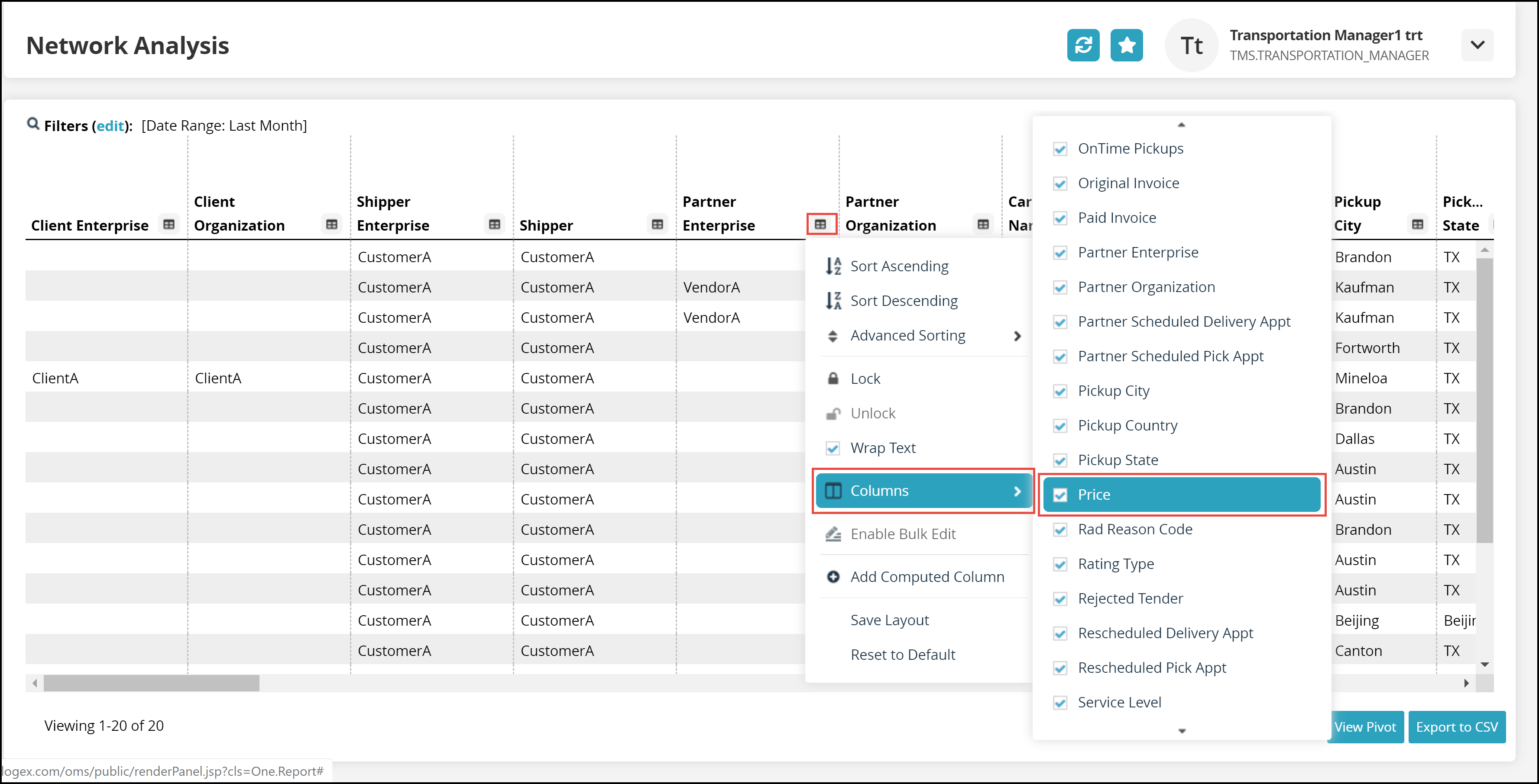
The Network Analysis report appears.Click any column header link and select Columns and click the Price checkbox.
The Price column appears in the report.Click View Pivot to view the report in the pivot format.
Click the Export to CSV button to export the report to a CSV file.